Creative Direction & Visual Identity
RENDEZVOUS

President: Mads Martin | Creative Director: Amélie Salahie | Project Manager: Ja Johnson | Photo & Video Lead: Justice Black
Creative direction, visual identity, and collaborative event strategy for the A+GD program’s Fall 2025 portfolio show.
As a graduating cohort, our class of 22 designers worked together to create RENDEZVOUS, CPCC’s Advertising + Graphic Design program’s Fall 2025 portfolio show. I led the creative direction and consistent visual execution of our show’s theme, conceptualized by Mads Martin. My scope of work included a full visual identity guide, multi-piece invitation design, collaborative web design, interactive guest passports, and designer spotlight post templates.

-
We are coming from everywhere and going anywhere, but right now, for the first and last time, we are connecting here, in this present time and place.
RENDEZVOUS lightheartedly captures the anticipatory nostalgia of a journey reaching its end. It plays off the theme of travel, drawing inspiration from vintage ephemeral mementos and Wes Anderson’s retro art direction. It’s eclectic yet intentional, unified by structure, mood, and composition. RENDEZVOUS reminds us to be present in this moment together before it passes, but it never takes itself too seriously. Good things in life may be fleeting, but new, good things are always ahead.
-
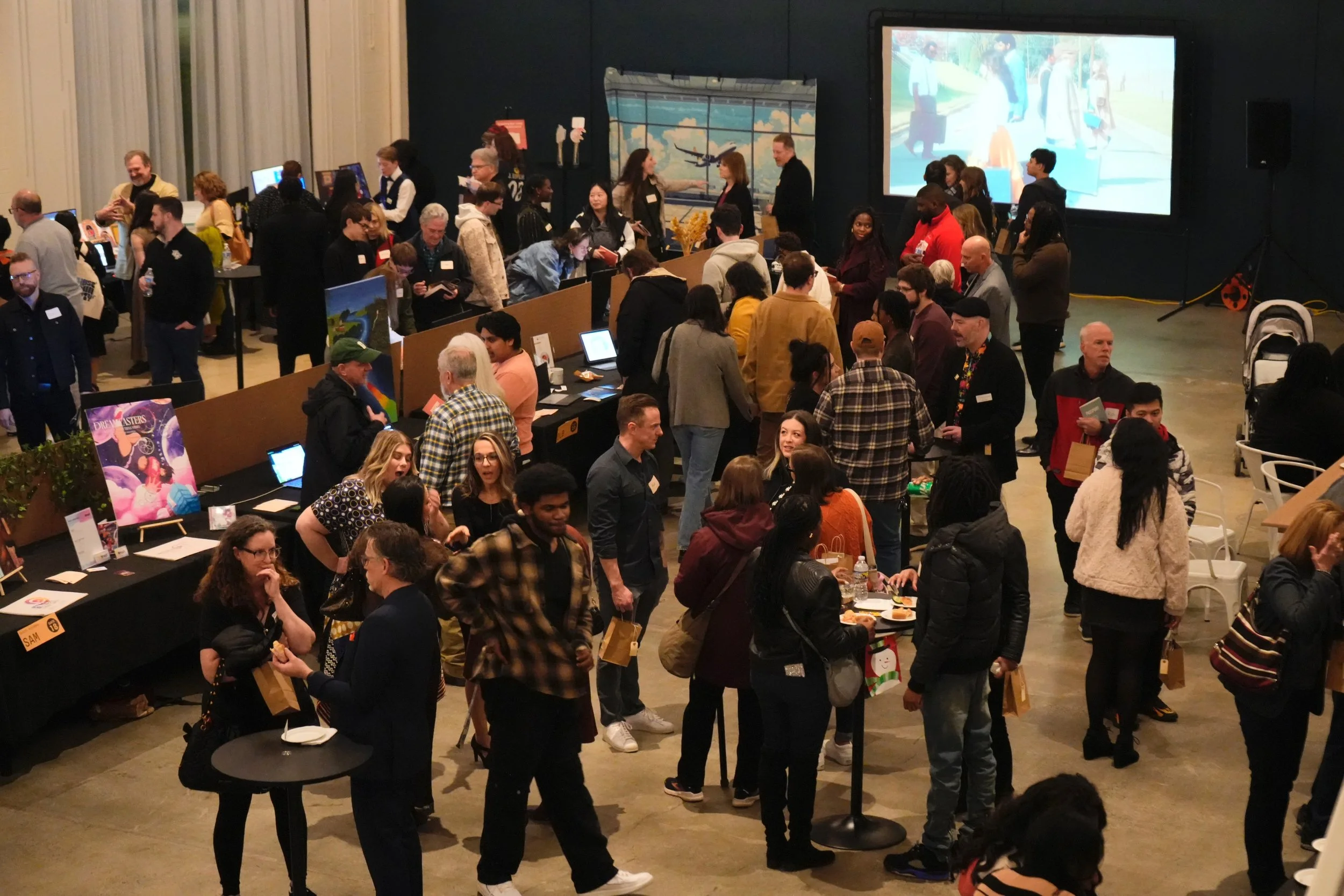
The RENDEZVOUS event is intended to feel immersive and memorable, full of small moments of delight. Conceptually, the experience is framed as a journey, with each designer’s table being a destination to explore.
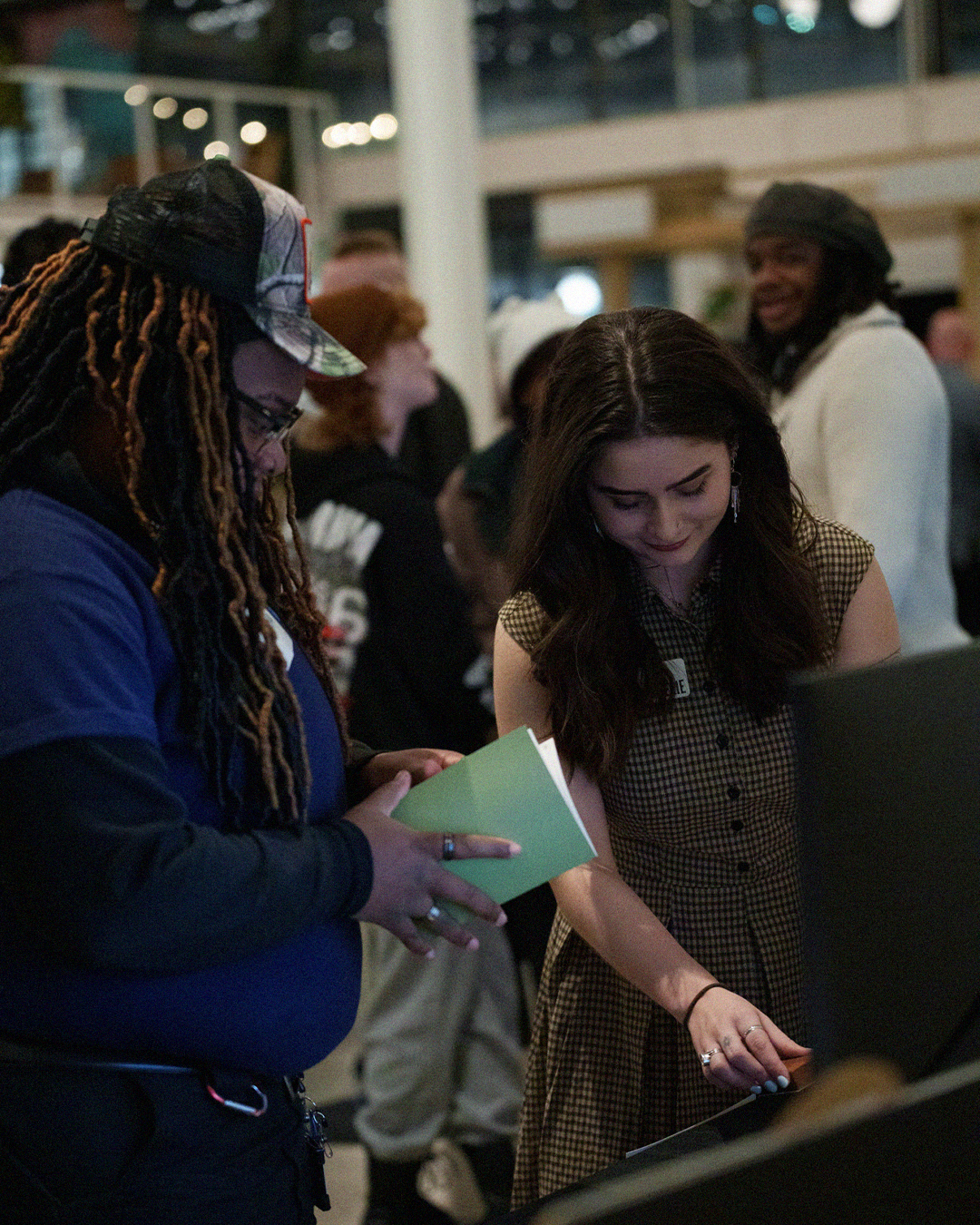
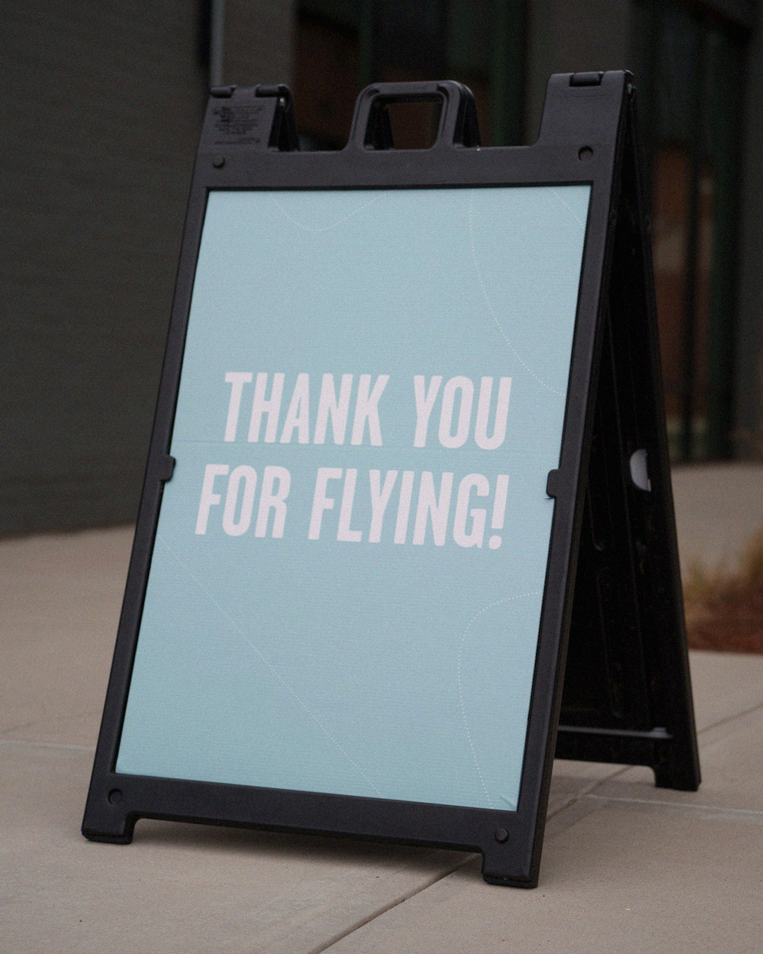
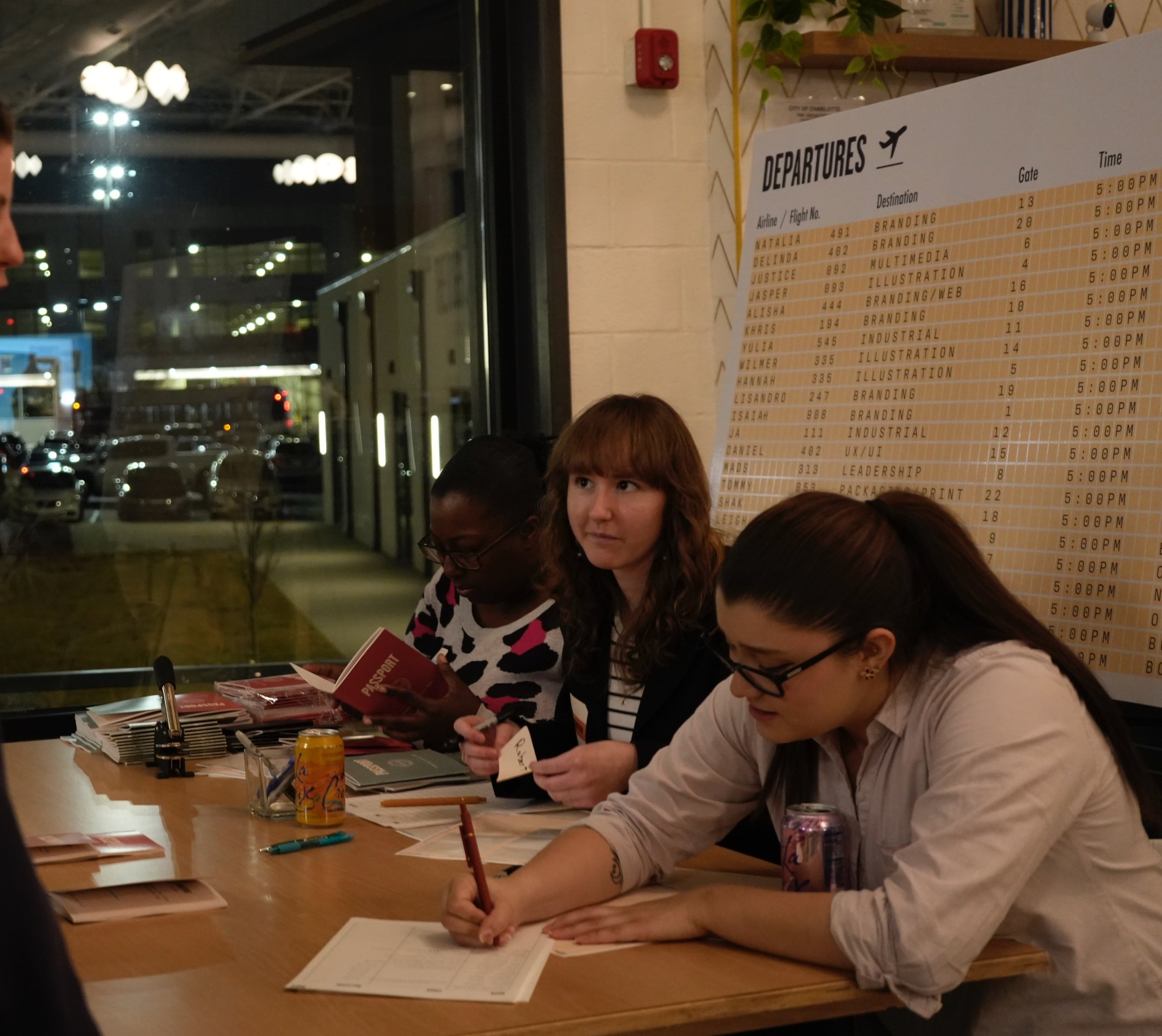
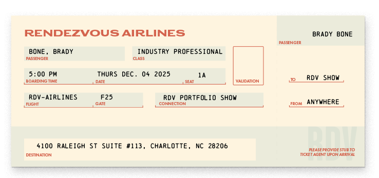
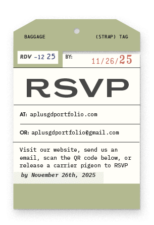
Some theme activations include:The guest sign-in table is framed as an airport Check in. A boarding pass customized with guest names was included in each invitation, which can be brought to the show to “board the flight.”
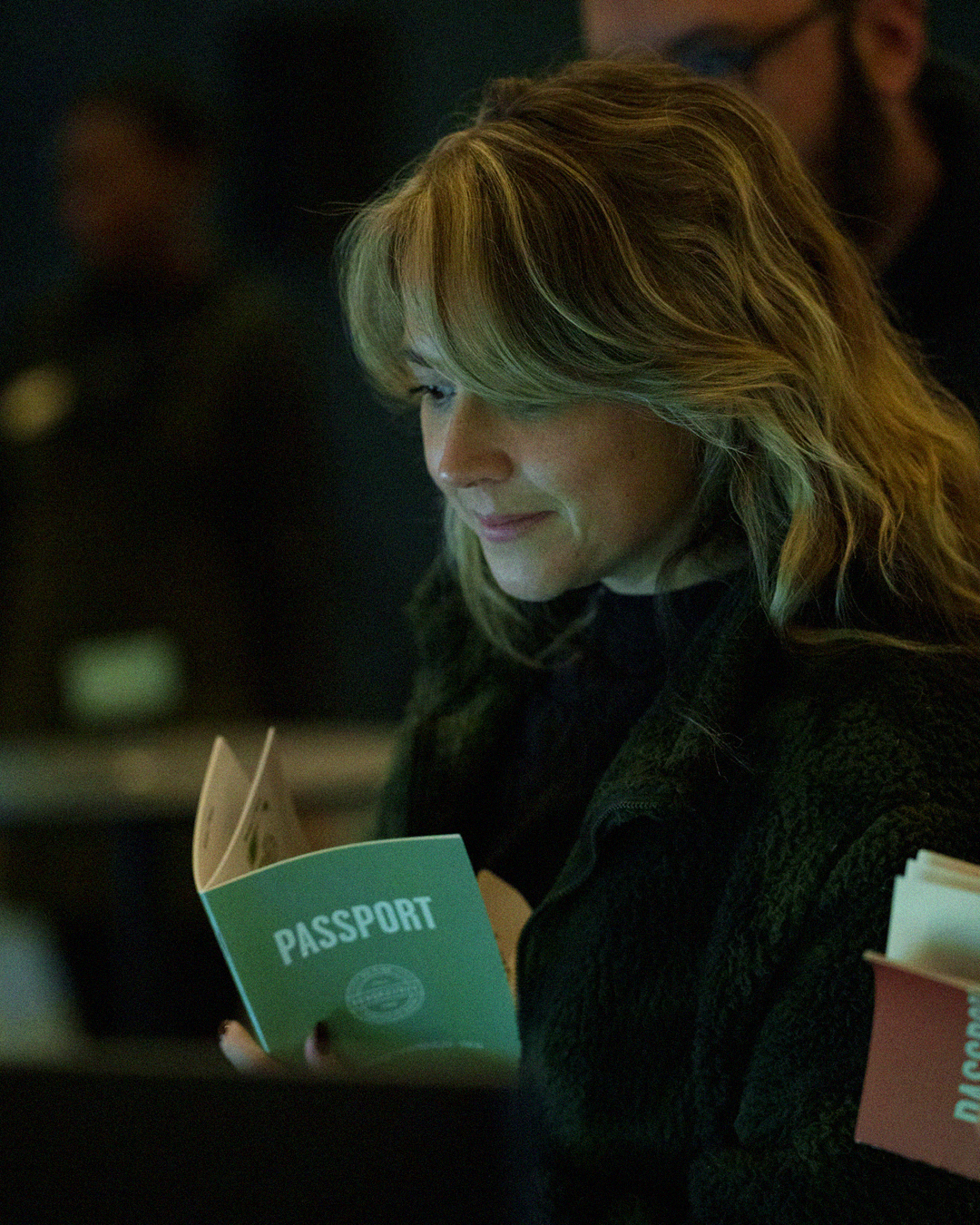
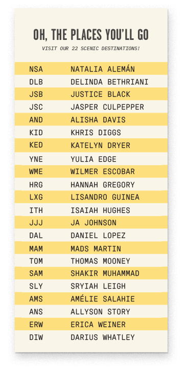
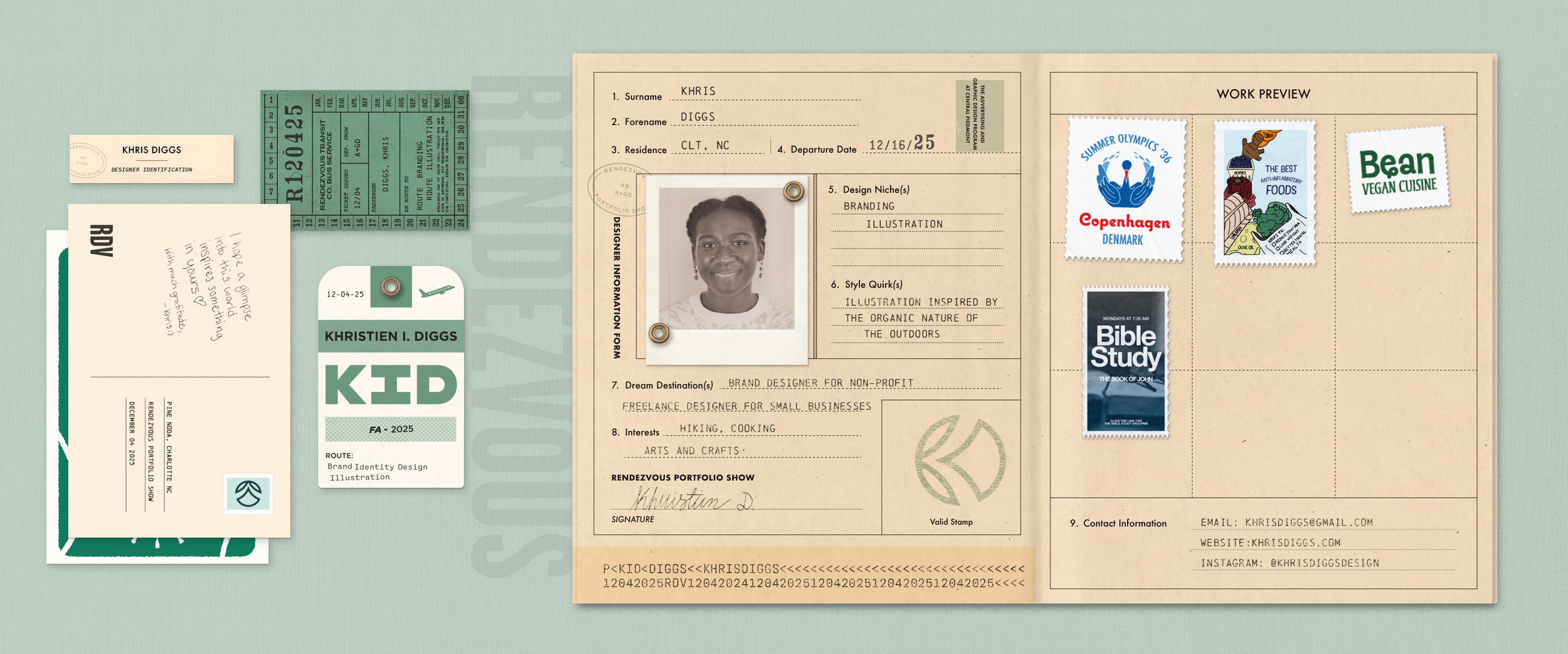
At Check in, guests receive a passport. Each designer’s table has a custom logo stamp that can be used to mark their personal ID page, encouraging guests to visit each destination to fill their booklet.
After Check in, guests pick up a bag at Baggage Claim, which they can use to carry their souvenirs as they browse. These collectibles include mementos like designer business cards, postcards, and stickers.
Located in the RENDEZVOUS lounge loft space, a paper plane station provides guests an interactive craft to take home.
Framed as flight attendants, indoor volunteers push snack carts around the venue, with volunteers in vests directing “flight traffic” in the parking lot.
-
The following guidelines were provided to the team to help ensure consistent execution.
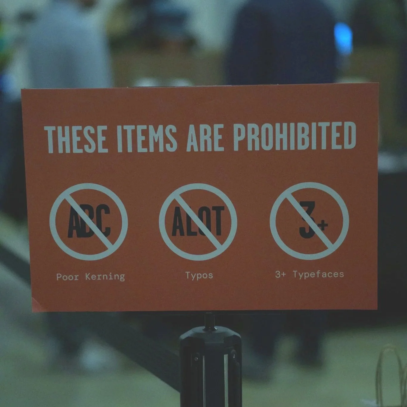
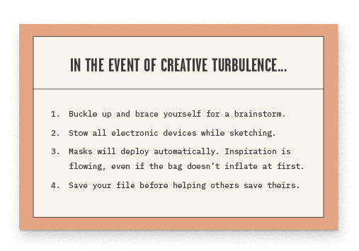
RENDEZVOUS is authentically vintage, not forced. Avoid clichés.
Photos or scans of lightly worn, vintage travel mementos are ideal visuals; intentional digital texture can replicate this look (applied subtly where needed). Consider how you can create curated variety with ephemeral mementos.
Tip: imagine paper mementos intentionally arranged/layered in a grid.
If used, illustrations should mimic vintage styles (e.g. vintage postcards). They should not look overly digitized or vectorized; stay true to a retro feel.
Reference the layout, hierarchy, and style of retro tags, passes, tickets, etc.
Lines, boxes, type that looks imperfectly printed on paper. Subtle quirks.
Allude to the experience of flying and traveling with wit and taste. Small references here and there go a long way.

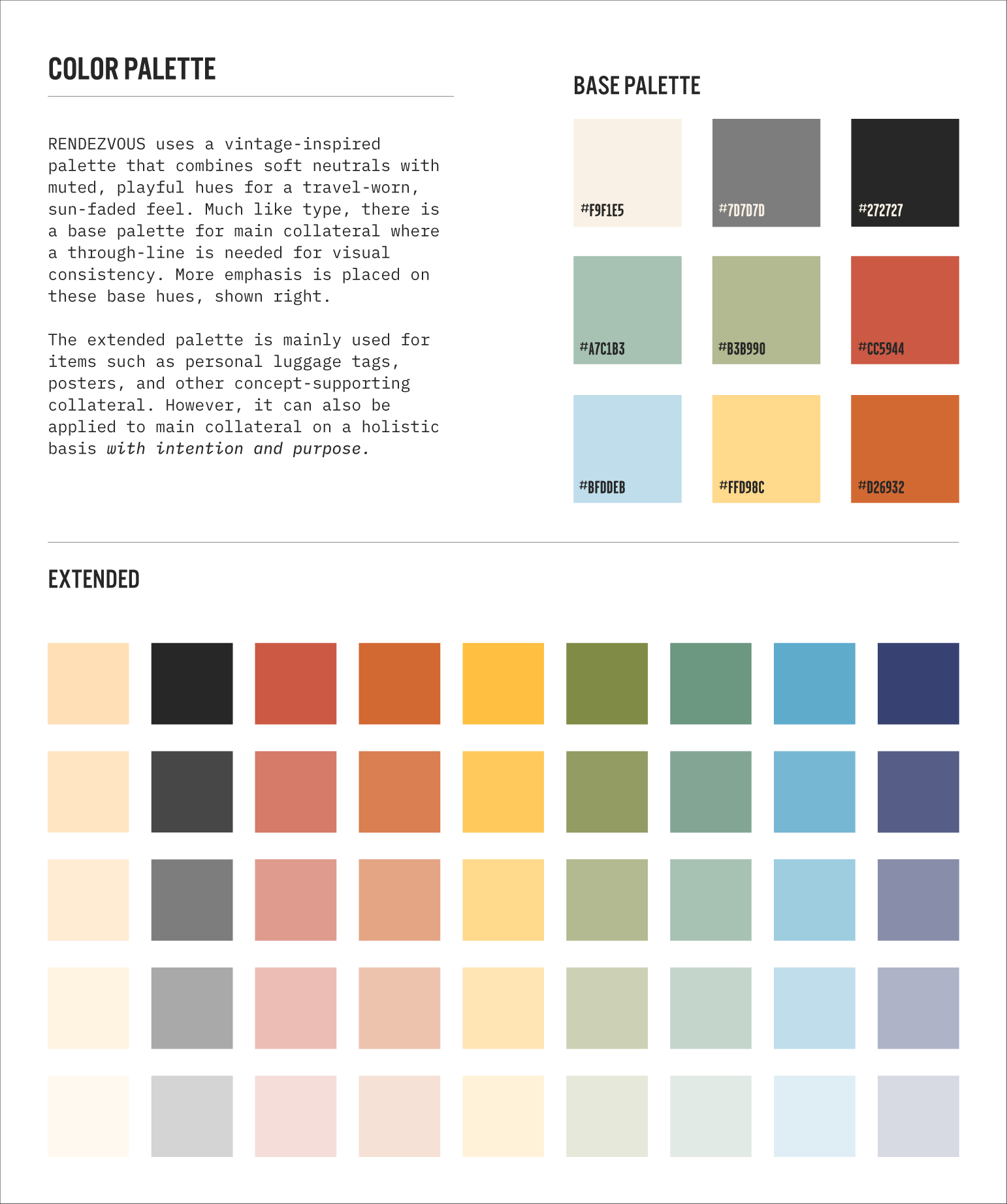
In order to achieve a look that feels varied yet curated, I created an extended type and color palette that creates guided flexibility around how RENDEZVOUS presents itself in supporting collateral.
FONT & COLOR PALETTE


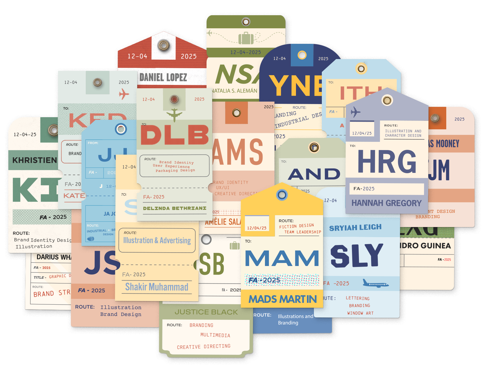
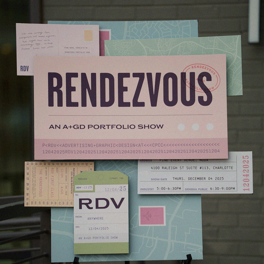
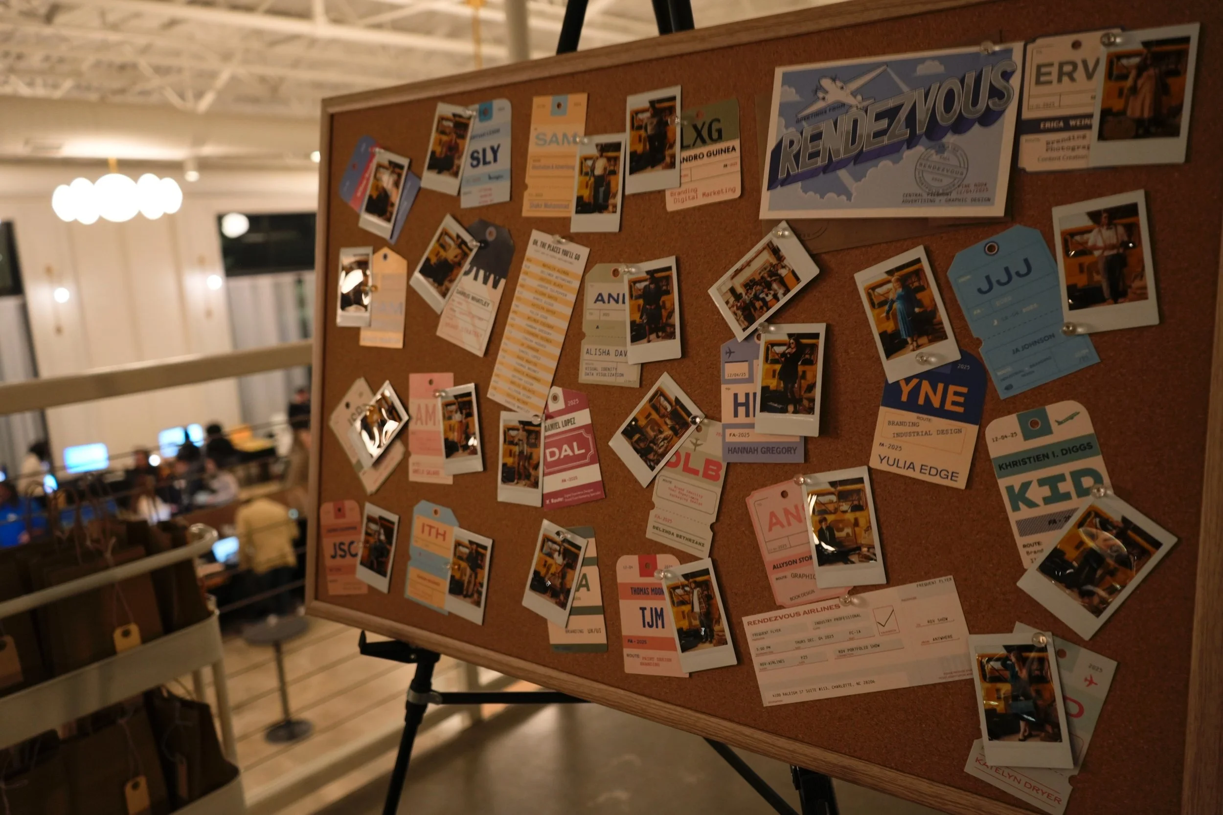
LUGGAGE TAGS
With luggage tags as a driving motif, each designer created their own to visually represent themelves using a provided template file. These tags frame the designer’s initials as an airport code, with “route” info used to present their design niches.
These are a relevant example of how opting for an extended palette allowed for visual variety, unified through mood and feel.
THE INVITATION
Multi-piece folder invitation design with embossed back, hand-assembled by our team.


DESIGNER SPOTLIGHT POSTS
Each designer was spotlighted in an Instagram post template that uses a seamless carousel experience, customized through color and placement. These posts provide insight into each designer using theme-driven visuals, subtly preview their work, and feature a favorite project.
IN THE DETAILS
The thumbail for these carousels includes a glimpse of each designer’s postcard design, a handwritten message and custom postage stamp, their personal luggage tag, a bus ticket with custom route info, and a designer identification name tag. The ID book template introduces them thematically, with postage stamps motifs used to tease their best work.

PASSPORTS
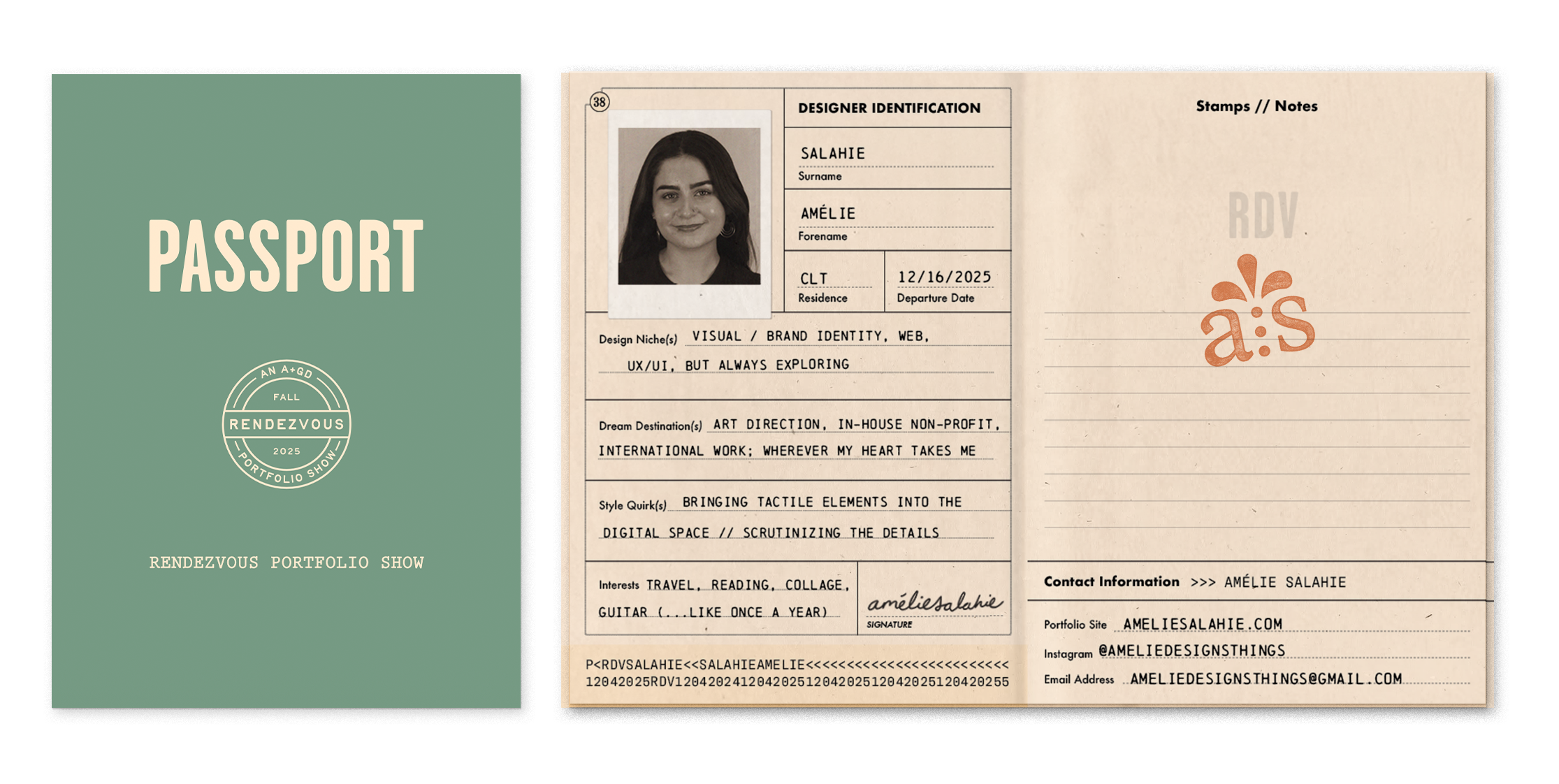
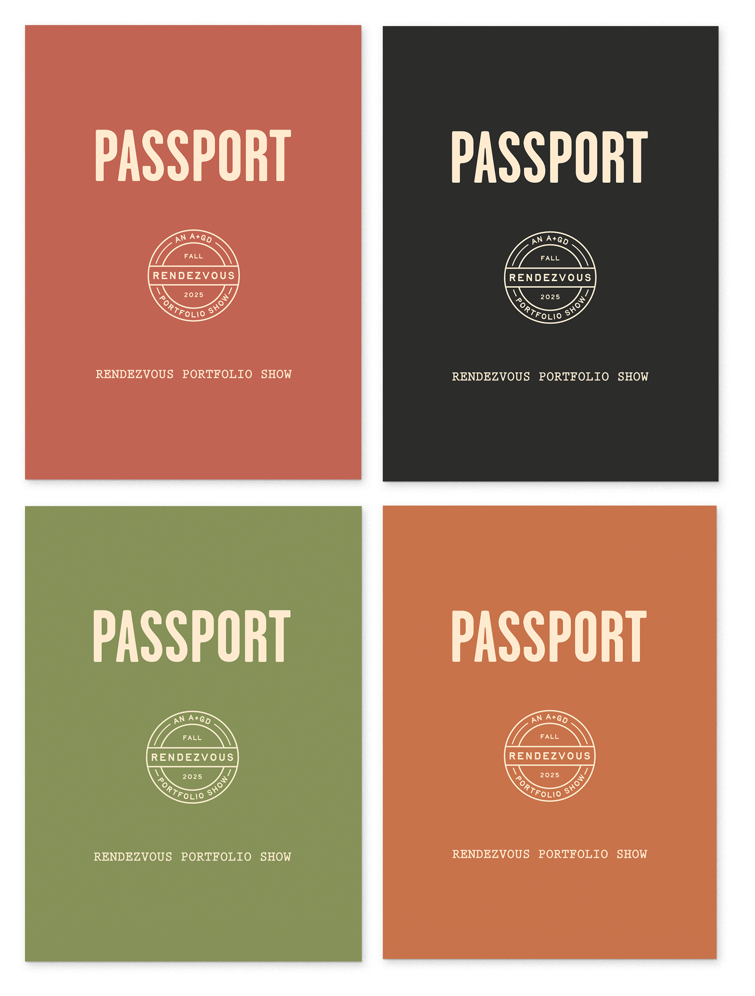
Available in five different color options, these passports were given to all attendees upon checking in. They helped guide the RENDEZVOUS experience, incentivizing connections by encouraging attendees to collect each designer’s stamp.
These booklets also ensured attendees left with every designer’s contact info paired with their ID photo for convenient recollection later on.