BOOKBARTER
App Design & Case Study
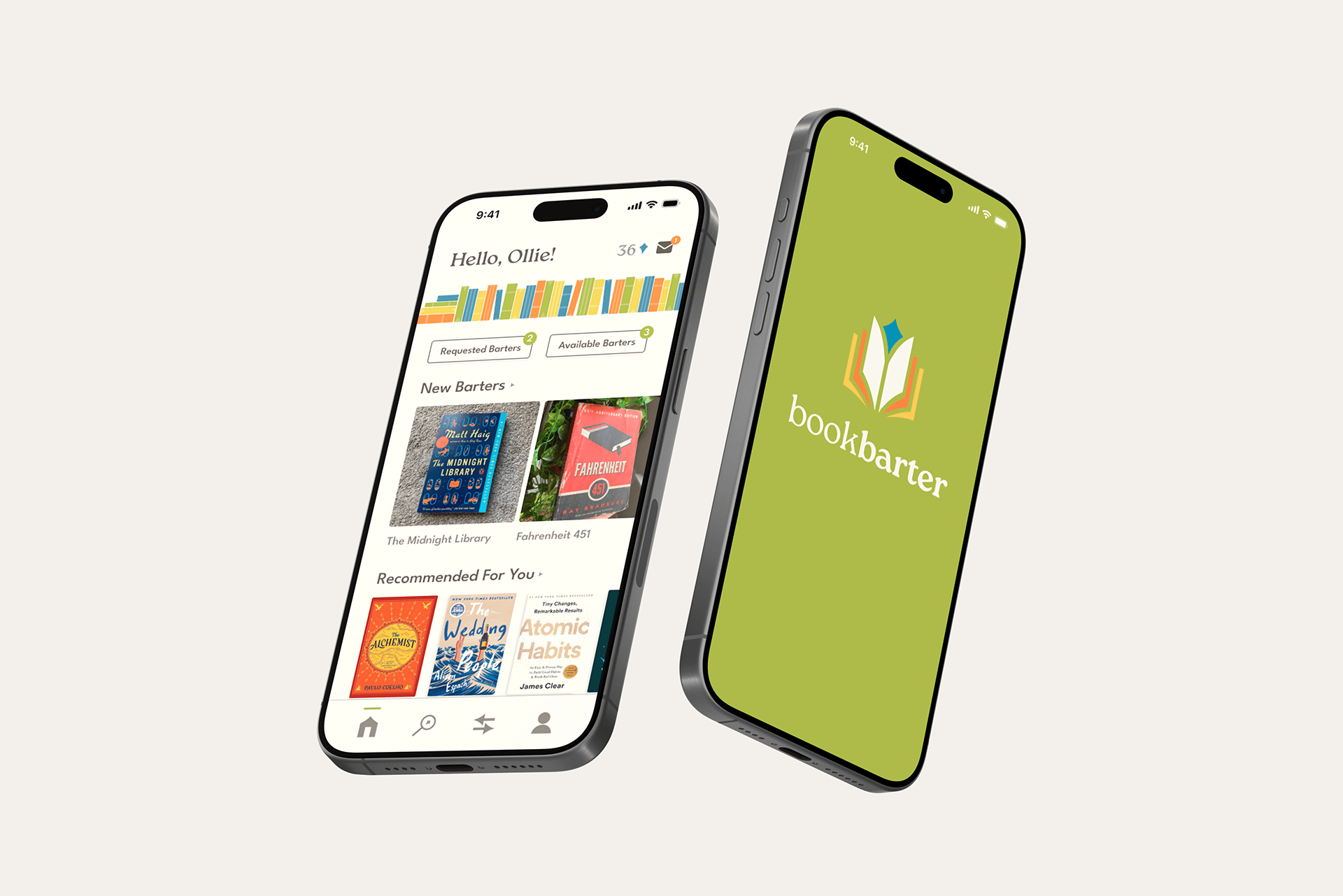
Bookbarter is a conceptual interface design for a book trading, discovery, and community building app.
-
Bookbarter is a platform created to foster community and affordability for book-lovers. Designed with sustainability and connection in mind, it lets users swap books locally and nationally, saving them money while allowing them to share their joy of reading. Personalized recommendations and custom lists based on genre, mood, or theme help readers discover new favorites. With a virtual shelf to track your current collection and spark tailored suggestions, Bookbarter makes it easy to refresh your library, connect with fellow book-lovers, and give cherished books a second life.
-
Book trading via an accumulated credit system called Lapis, at no required cost to users apart from shipping fees. The Lapis value of a book is based on its condition.
Pinterest-style book discovery based on mood, pre-made lists, frequently read genres, etc.
Digital bookshelf that allows users to track their current book collection.
Community Reviews with a Verified Review feature to vet the credibility of book ratings.

Main Navigation Screens
FULL PROTOTYPE DEMO
CASE STUDY
Research Phase
To ensure I developed a relevant and usable approach, I spent quality time collecting general data on reading habits, user interviews, and a competitive analysis. This included research on user attitudes toward used books and established reading platforms to uncover ways to improve how people discover and share books. This led me to explore a primary competitor, BookMooch (now out of service).
Although it had room for improvement in its interface design, it inspired Bookbarter’s credit-based exchange system. I also analyzed Goodreads and Fable, identifying opportunities to stand out with a more intuitive interface, free access to key features, and a flexible rating system that better reflects user feedback.

Affinity diagram based on four interviewees and a 32-person digital survey
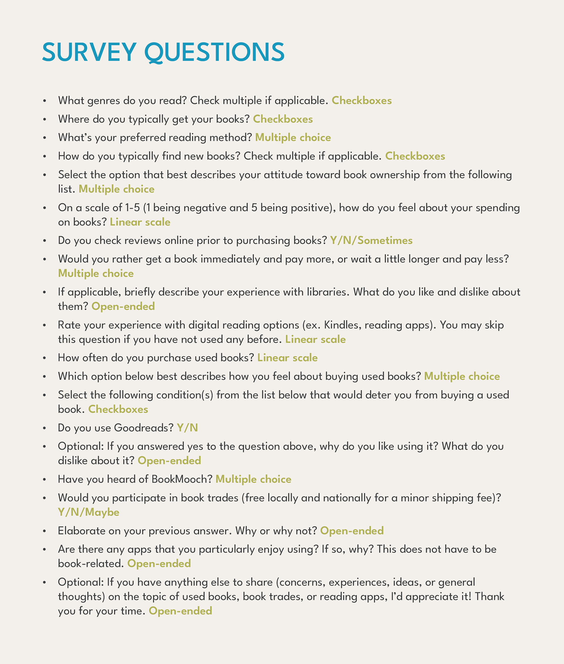
Questions asked in digital survey
Insights
After synthesizing my data, I found that some users face frustration with the cost of books, lack of storage space, limited availability at used bookstores, and long wait times at libraries. A key finding was that readers enjoy building book collections and tend to keep cherished books long-term, but are more willing to part with books they value less. Some users question the need for a digital reading tool, with concerns about the relevance of an app in enhancing the reading experience. To address these issues, I determined that a digital solution should focus on practical use—saving users money through book trading—while also fostering community engagement, similar to platforms like Goodreads. Additionally, including features that appeal to book collectors, like an interactive bookshelf to track owned books, offers the opportunity to enhance the experience and encourage sustained user interaction.
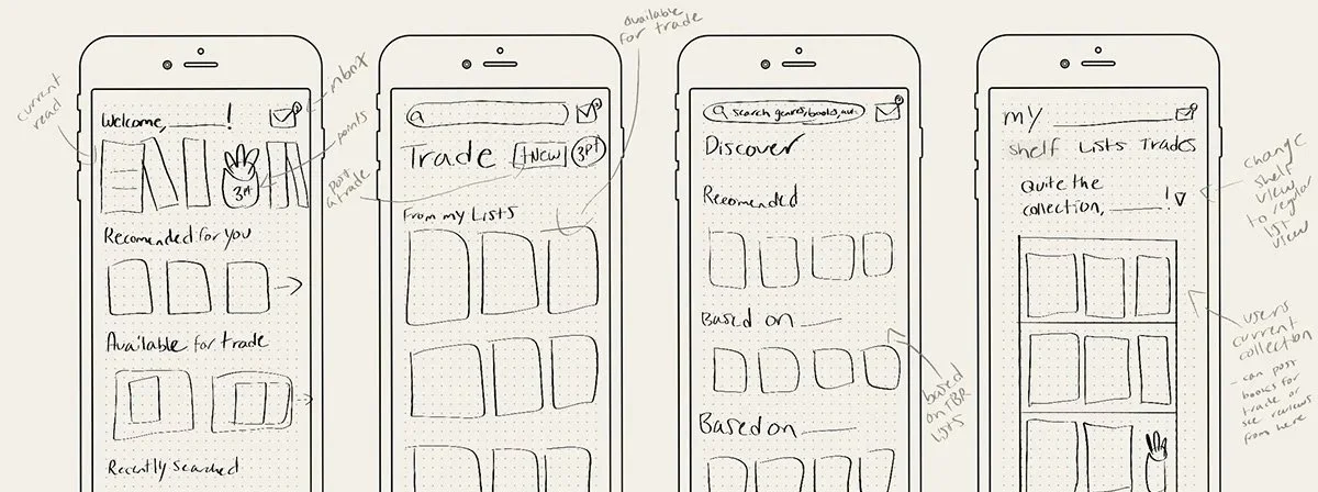
Wireframing & User Flow Exploration
As I moved into designing the interface, I explored various layouts through sketches, a flow map, and refined wire-framing. Ultimately, I decided to divide the app into four main navigation screens: Home, Discover, Barter, and Me. I also chose to create three subsections under the "Me" page: Profile, Lists, and Shelf. This felt like the most streamlined approach to splitting up Bookbarter's main features in an intuitive, user-friendly way.
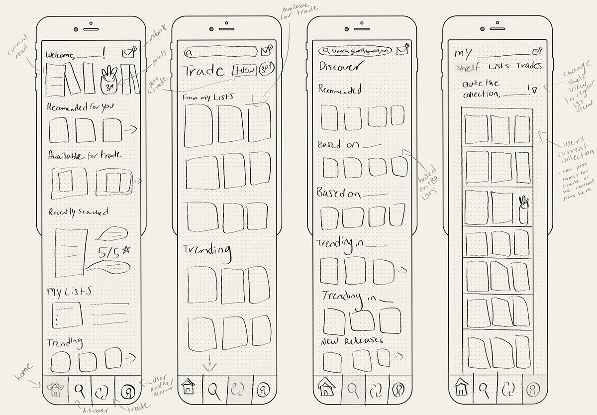
Low-fidelity wireframe sketches
Interface Identity

-
Bookbarter’s brand is built on three guiding principles: sustainability, community and accessibility. As a result, it felt integral to create a solution that feels approachable, friendly, and down-to-earth. I designed a simple, minimal, and intuitive interface that still carries personality through color, type, and playful graphics. The color palette combines soft off-white and charcoal grey with vibrant accents of teal, orange, green, and yellow, creating a warm, bookish feel. The logo and header font, Roca, enhances this approachable tone, while the secondary font, League Spartan, maintains a clean, readable balance.
-
I designed Bookbarter with simplicity, clarity, and user-satisfaction as my guiding objectives. Adding subtle touches of character, like colorful book graphics and the in-app shelf, allow the interface to be enjoyed by a variety of users without sacrificing personable qualities that are essential to Bookbarter’s brand.
-
Initiated Barter - A barter initiated by the user.
Requested Barter - A barter another user has requested from the user.
Confirmed Barter - A barter accepted by the user who posted the barter.
Saved Barter - A barter the user saved for later.
Shelf - A virtual space to view and track user's physical book collection.
List - A curated collection of books the user wants to read.
Lapis - The currency system that allows users to initiate barters. Gained by shipping books to other users.
Looking Forward
The logistics behind the technical and financial maintenance of Bookbarter would require some more consideration. While avoiding pop-ups and generic digital advertisements would be essential to maintaining Bookbarter’s intended experience, some ideas for funding could include book-related ads, user-paid book clubs, or author-funded promotions. The Lapis point system would also need to be fleshed out to logically account for both the shipping cost of a book and its condition.
Another strong opportunity for development could be Bookbarter’s relevance to local communities. Orchestrating safe, centralized book exchange meetups would help mitigate the financial barriers of shipping costs for some users. With more planning, this feature could also lend itself to local book donations and book clubs.