REMEND
Brand Identity & Collateral

REMEND is a conceptual handmade clothing label that collaborates with independent fashion designers and up-cyclers called Makers.
Brand identity for an up-cycled clothing label rooted in individuality, no-bullshit sustainability, and bold self expression.
-
REMEND’s differentiator is its commitment to anti-greenwashing. It speaks with direct transparency about how it meets sustainability goals and where it falls short. it has nothing to hide and nothing prove.
Modeled around uplifting Makers, REMEND compensates partnering designers, and compensates them well. Each piece is priced to honor the labor it took to create, as well as cover operating expenses — in plain terms, REMEND pieces are not cheap. To protect customer’s investment, its collaboration with Makers involves ensuring the quality and longevity of each piece sold.
Individuality, inclusivity, authenticity, and practical sustainability are REMEND’s guiding moral pillars.
-
To cultivate REMEND’s look & feel, I crafted five multimedia collages from printed photography, paper and textile scraps, beads, and hand-stitched thread. These scanned visuals connote the notion of used pieces coming together to form something distinctly new (yet brimming with presence and depth). I opted for an understated black and white palette to accompany these visuals to place proper emphasis on the pieces themselves.
Hand-lettering and organically texturizing REMEND’s logo, shown in its primary and secondary expressions below, felt like the truest approach to developing an identity that instantly reads as deeply, artfully human.

Handlettered logo design
A wholly unique tag for a wholly unique garment.
To convey the individuality of each REMEND piece a notch further, I created a two layer tag design with a distinctive organic shape. The upper layer contains care instructions, opening to reveal an layer that’s made specific to each piece. This custom layer tells its garment’s story, credits its Maker, and is hand-stitched with a cut of the fabric used to create it.


NO FRILLS, NO WASTE
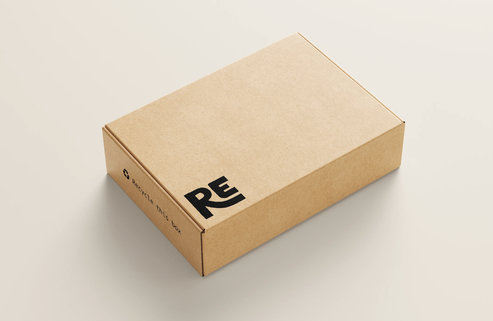
REMEND is artisan and sustainable across all touch points. This minimal packaging design uses stamped ink on a corrugated box for a recyclable yet high-end solution.
Avant-garde simplicity via minimal stamped ink placement & natural cardboard
Handmade quality conveyed through packagihng durability & structure
DIGITAL STOREFRONT // an exploration
Partial website exploration including collage visuals in use, instances of branded language and tone, and an experimental product browsing experience for REMEND’s low-inventory storefront.
-
With no physical store, REMEND solely exists as an online platform. This partial exploration showcases REMEND’s digital storefront. Although a fully-realized web prototype isn’t achievable without product photography, fleshing out its user interface and experience was an essential component in developing its identity.
REMEND’s avant-garde positioning allowed me to intentionally and tactfully challenge UX/UI norms. When it comes to product browsing, its low-inventory structure differentiates it from typical fashion brands. With this in mind, I explored an experimental, inclusive filtration model that prioritizes broad, explorative browsing. Displaying all garment categories by default, users filter out what they don’t want to see. This makes the browsing experience feel fuller on first encounter and encourages users to explore a braoder array of pieces — thus promoting the work of more Makers.
-
REMEND pieces are grouped by collection: Timeless (essentials, basics) & Statement (unique, bold, one-of-a-kind). Additional, limited time collections may be added, and the Archive collection contains left-over stock from these temporary collections.
REMEND has a loose approach to defining garments by gender, offering greater flexibility while browsing clothing by opting for terms like “Masculine” and “Feminine” over traditional gender filters. While a fully inclusive model would deny prescribing these categories altogether, this language strikes a balance between acknowledging the experience users expect and avoiding restrictive labeling around who can wear what. -
In a more final iteration, this filtering architecture would account for sizing-specific filters, which are a vital qualifier in any clothing browsing experience.
Due to its unconventional structure, this experience would need to endure solid user testing see if it is a refreshing deviation — or simply too counter-intuitive to the anticipated user journey.