FRESH ON THE MENU
UX Research + Redesign
Lead UX/UI Designer: Jamal Simpson | UX/UI Designer: Amélie Salahie | Developer: Bill Billings
Fresh on the Menu connects foodies to SC restaurants that source clean, local ingredients.
The Fresh on the Menu website redesign needed to support two key goals: helping users quickly discover local restaurants and encouraging chefs and restaurants to join the program. Our team was tasked with improving the overall user experience by fixing search functionality, streamlining navigation, and updating site layouts for clarity, accessibility, and engagement.
MY ROLE
I led iterations of Fresh On The Menu’s homepage and search function redesigns. I also conducted a competitive analysis of leading map-based search experiences to identity familiar patterns across similar platforms.
OVERVIEW
New Homepage Design
Updated Restaurant Search Function
CASE STUDY // Fresh on the Menu Search Function
The Before
Opportunities
Our audit revealed issues that limited the site’s ability to support its core goals: helping the public easily find Fresh on the Menu restaurants and encouraging chefs and restaurants to participate in the program. Main opportunities for improvement included:
Fixing the broken restaurant search function by by introducing map-based search
Alleviating accessibility issues with color/text contrast to better align with WCAG guidelines
Reduce high drop-off rate by creating clearer information architecture and site navigation
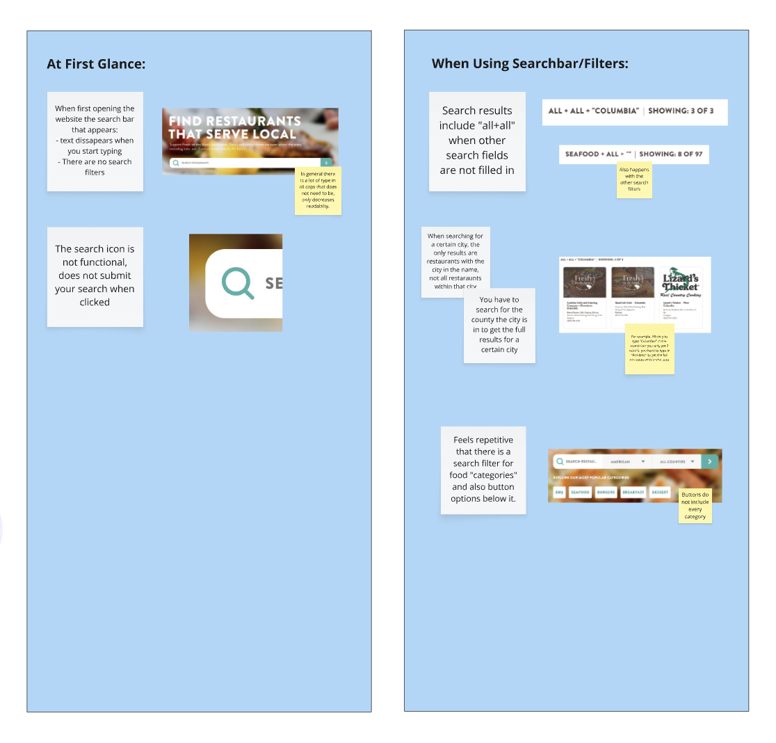
A portion of our site audit, revealing key areas of friction across the homepage and restaurant search page.
Research + Approach
To understand where the experience was breaking down, we combined findings from our audit with a competitive analysis and lightweight user testing on 4 individuals.
The original Fresh on the Menu site relied entirely on a list-based browsing experience and did not include any geographic context (along with not displaying all relevant results when searching by city). Insights from our user testing revealed that the original search function made it difficult for users to understand what options were available near them. We concluded that:
Users are looking to quickly and easily look for good food in their area.
Users search by town/city, not county.
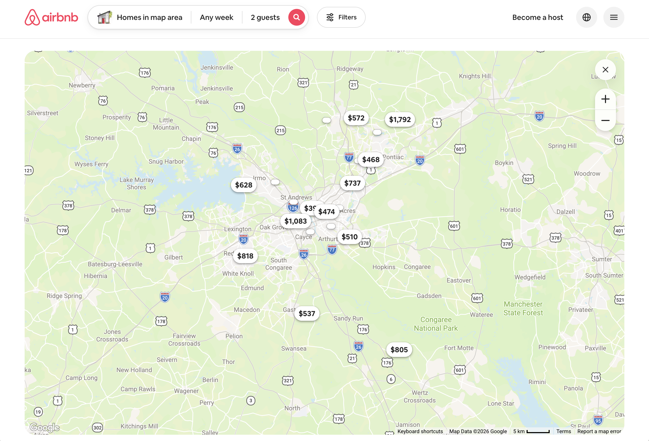
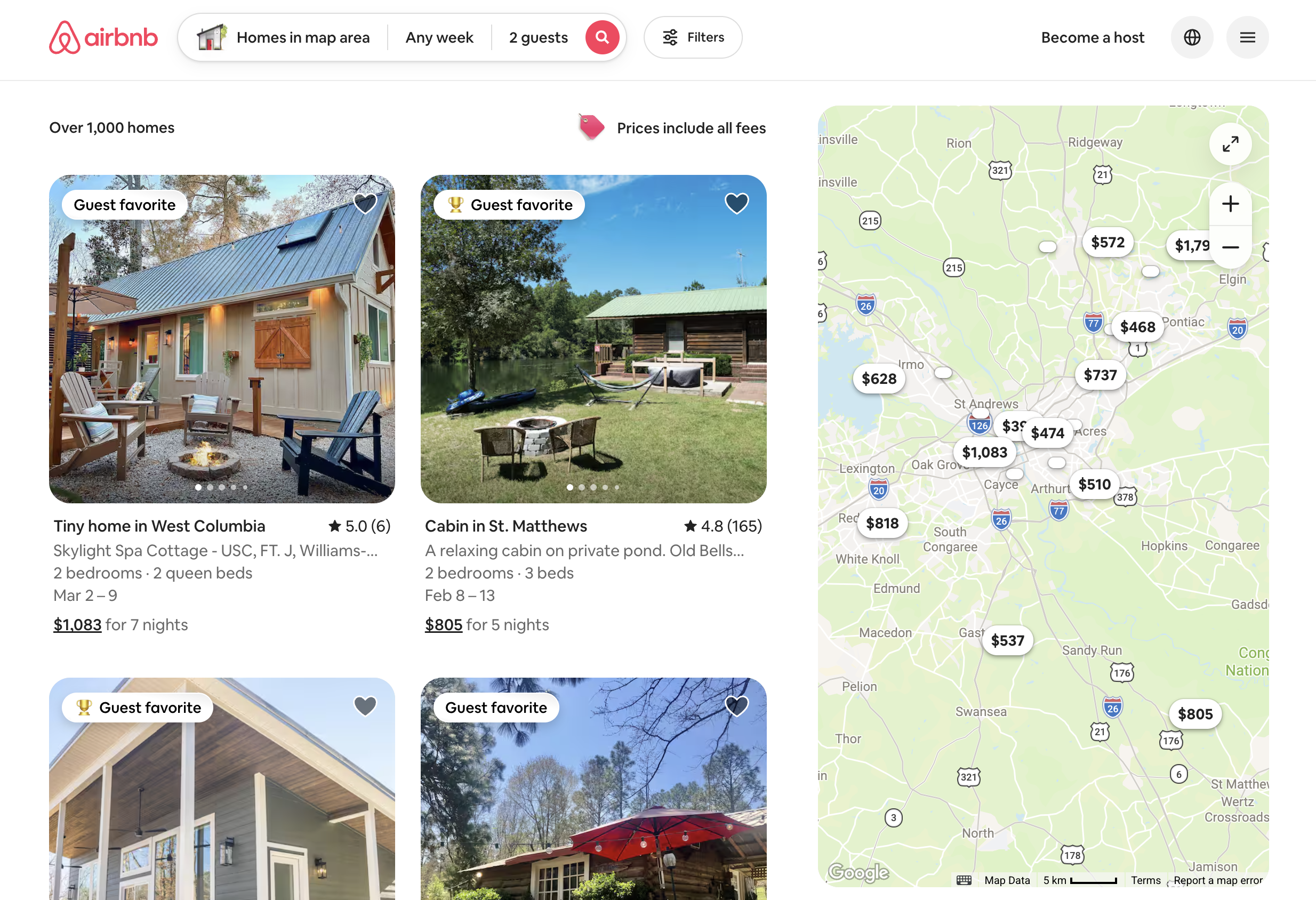
Included in our competitive analysis, Airbnb’s map and list browsing experience demonstrates a flexible approach to location-based search, allowing users to seamlessly shift between spatial map exploration and 2-column list scanning.
Testing + Iteration
Early iterations introduced a fixed interactive map with a narrow, single-column results panel. While this added geographic context, user testing revealed friction when scanning results and comparing options. Incorporating this feedback, we explored a second iteration that provided users with greater control over how they search and browse.
Based on internal user testing and competitive insights, we determined:
Map-focused designs can overwhelm users who prefer text-first browsing, which reinforced the need for a flexible layout.
Users expect to shift naturally between spatial exploration on a map and scanning information in a list.
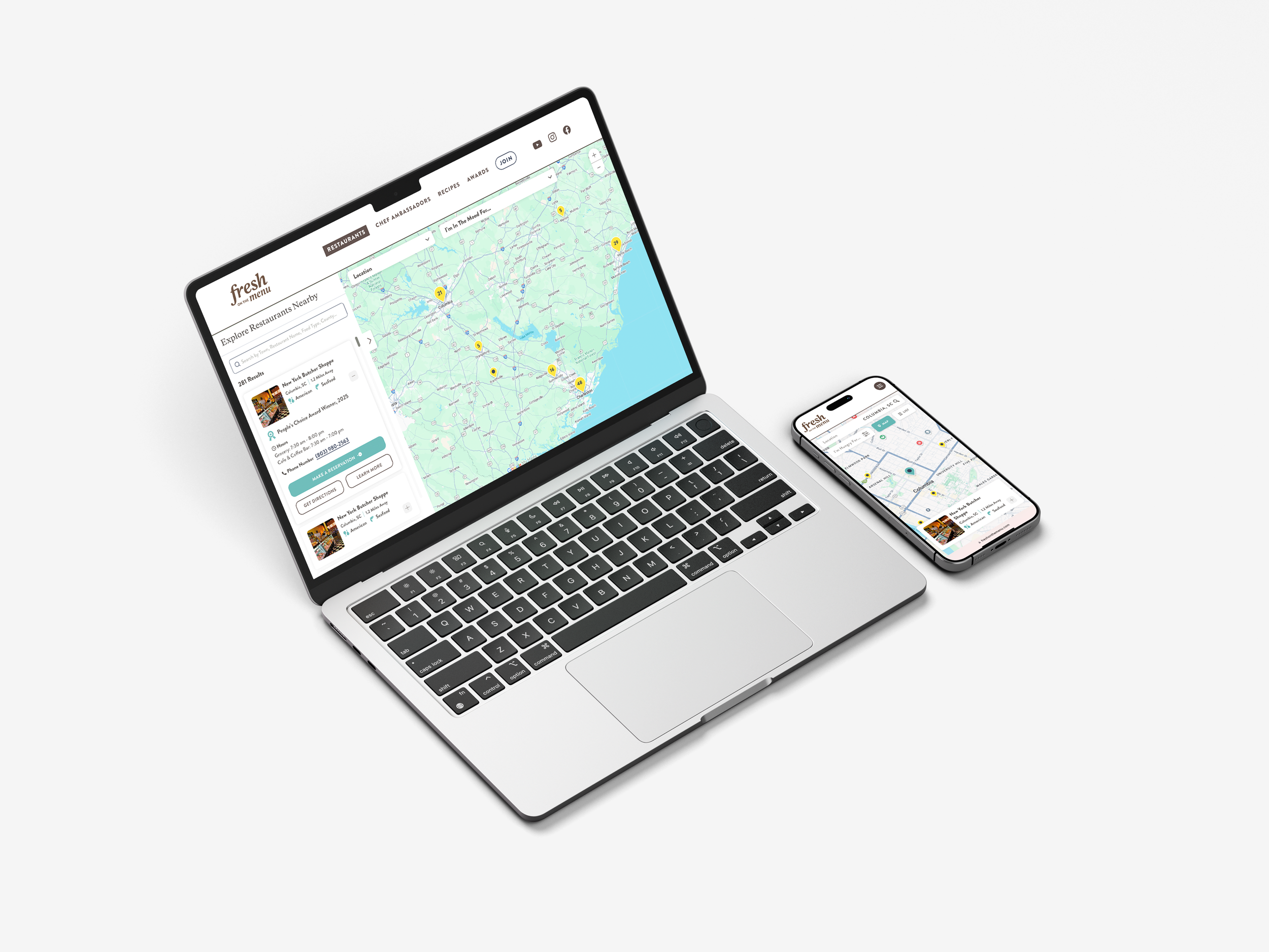
This informed our final design, which used flexible map and list browsing to preserve familiar list browsing while still adding intuitive spatial context.
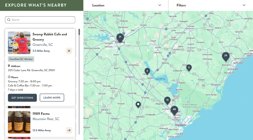
ITERATION 01 // FIXED
This iteration emphasized map exploration, but the single-column layout restricted how much information users could view and compare at once.
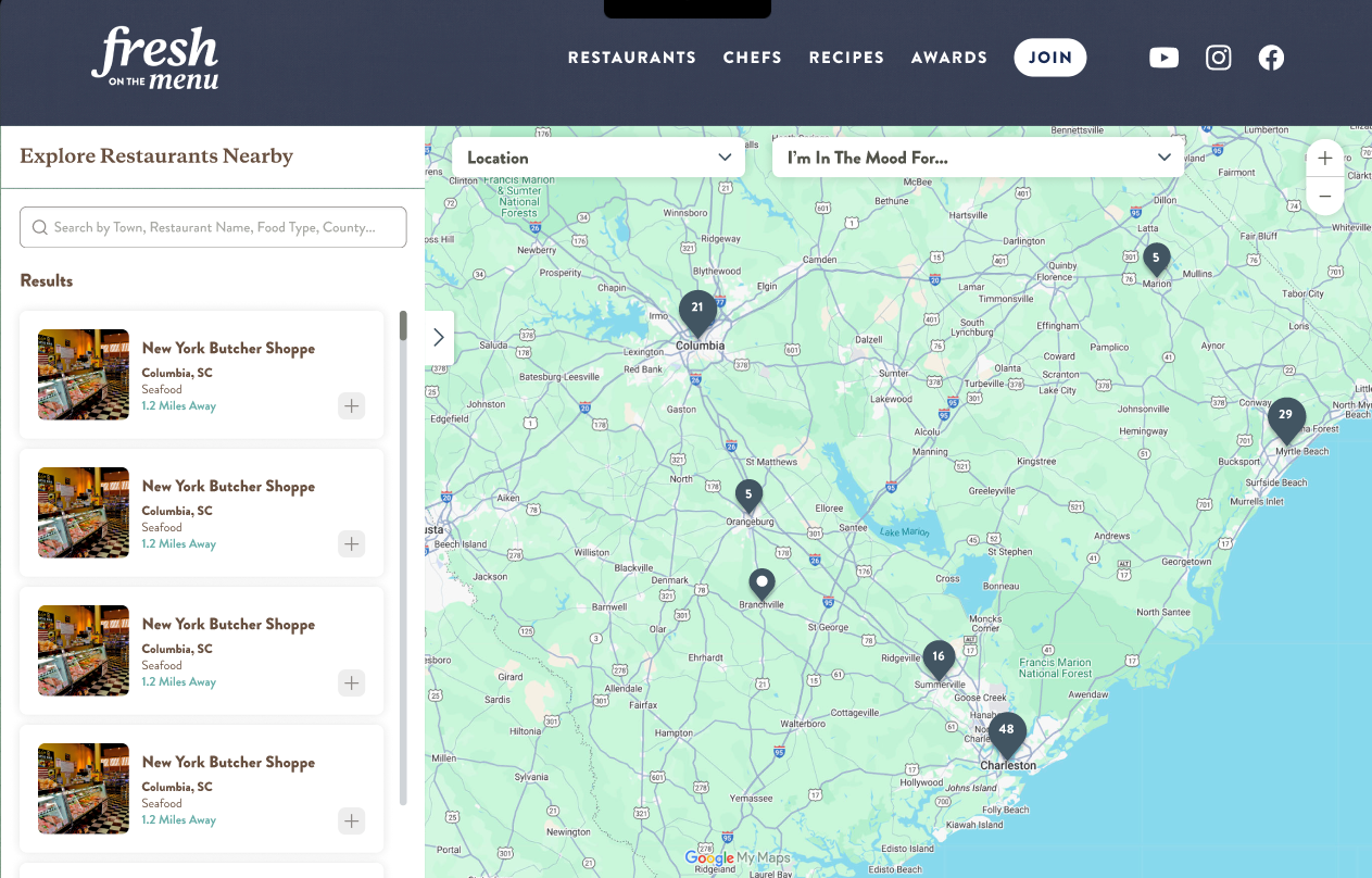
ITERATION 02 // FLEXIBLE
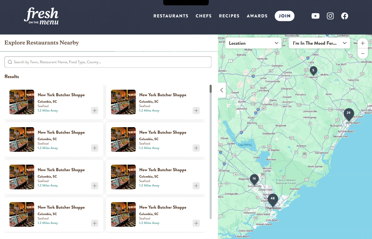
Iteration two introduced the expandable list-view, allowing users to choose whether they wanted to explore options via the map or list-scanning.
ADAPTING TO MOBILE
The mobile experience applied the same flexibility but separated the map and list into two easily navigable screens, optimizing space for both map exploration and list browsing on smaller devices.